|
Sometimes it's easier to change the fabric, than to update color scheme of entire embroidery
design. If you still prefer to stick to your original fabric choice - try to do the following:
Go to http://www.colormatch.dk/ or http://www.colorblender.com/ and try to find color
suggestions, using your fabric color as base color. These tools are very nice, and absolutely
free. So unless you're blessed with natural talent for matching colors, they can help you a lot.
Avoid using too many different colors. Usually, a more than 3-4 color family in single design
is too much. If you need more colors add lighter or darker shades within one color family.
Once you've selected 3-4 possible color schemes, try them again in your embroidery software,
by updating colors of your design until you're satisfied with how it looks.
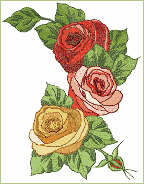
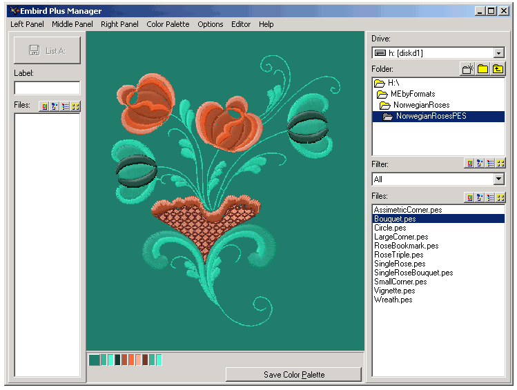
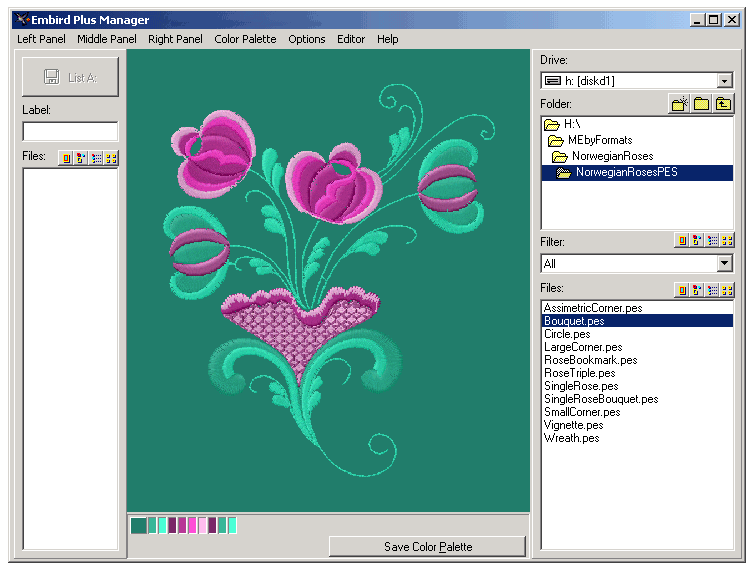
Here is an example of alternative color schemes for this same design, just on different
background fabrics (This really isn't an instruction - just an example.) We wanted to stitch
the Rose design on dark green background fabric. When selecting it on PC screen, it's quite
clear that original color of the design just don't fit. To match new color scheme, we've
used a program called ColorImpact (fully functional demo can be downloaded here:
http://www.tigercolor.com ).
We won't explain how to use this software, because first of all it's too easy to use
for any instructions, and second - you may eventually use an absolutely different tools
for matching colors. So these screenshots are just to show the general idea. Remember -
we didn't do any manual matching. Just picked up the background color, and this lovely
ColorImpact software suggested all the other colors, which matched well!
This is the first color scheme:
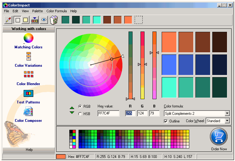
And this is how our design now looks on green fabric:
Here's example of another successful color scheme:
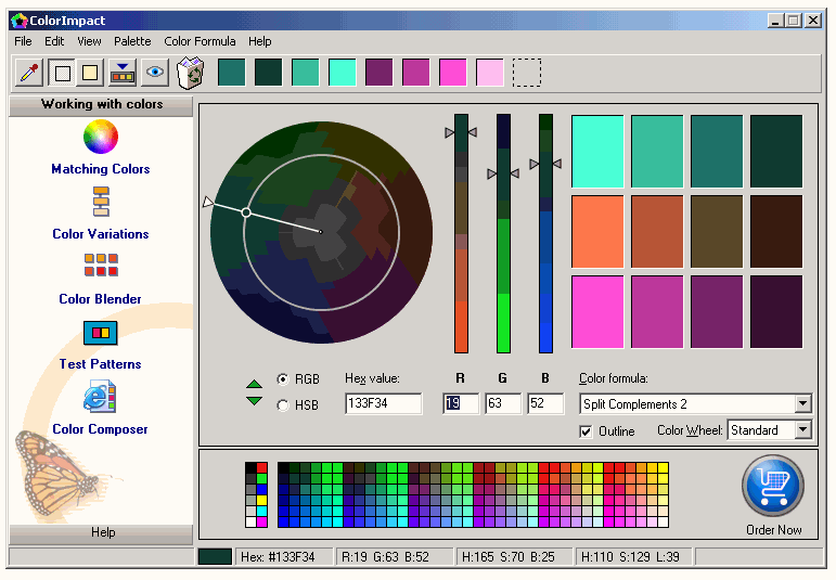
And this is how the design looks:
Of course there are more options and color variations for this design. The leaves could be
all blue, for example, like the software suggested. We just chose to use only part of the
offered colors. So please, experiment! This is exciting and fun.
Another, really foolproof way to match colors, is to use the same color of your basic
fabrics, and play only with color intensity of thread. This method doesn't fit all designs,
some designs will look dull and boring this way, but some will look great. For example, most
of our fonts, especially antique style initials, will look wonderful if embroidered like this.
Of course everything we've suggested for matching colors doesn't even touch the top of the
iceberg of color matching art. If you're curious to find out more - you may want to get a good
book, or two, about colors.
We don't have a perfect book ourselves so won't recommend the ones we bought. Perhaps
you'll find something better. We did find two awesome programs for matching colors though.
They aren't free, but seem to be a few heads above the free tools mentioned earlier. They
both have 15 days fully functioning demos, so try them out. Both are Great, each offering
different sweet extras. Really hard to choose between them, so check by yourself which
one you like better.
The first one is ColorSchemer ( http://www.colorschemer.com/ ).
And the second is ColorImpact ( http://www.tigercolor.com/ ).
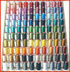
To choose the colors you need, just visit our Polyester Embroidery Thread category. It
offers a large selection of mini-thread-kits, sorted by color families - 10 thread cones
per kit. You may also purchase the entire palette of 260 thread colors, most-popular
kits of 50 colors and
100 colors, and
seasonal 24-color thread kits.
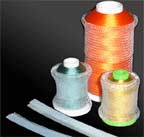
You may also want to get the free ThreaDelighT polyester conversion chart (in PDF format).
This color chart includes RGB number of each thread color, so you may enter this data into
your embroidery software and use for matching thread colors.
<-- Back to the main menu
|